There are several graphs collected into the Awareness Analytics dashboard. In this article, you can see an explanation of each graph and how it's calculated.
Overview of graphs
-
- Manager (Default)
-
- Group
Training completion
This section shows the overall completion status across all enrolled training.
-
Total enrollments – The total number of training enrollments across all users.
-
Total completions – The number of those enrollments that have been completed.
-
Percentage – The percentage of enrolled training that has been completed.

Training content
This section shows how much of the available content has been enrolled to users.
-
Available trainings – The total number of training modules available in your account.
-
Enrolled trainings – The number of training modules that at least one user is currently enrolled in.
-
Percentage – The percentage of available content that has been enrolled to users.

User completion
This section shows how many of your users are fully up to date with their assigned training.
-
Have completed all training – The number of users who have completed every training they are currently enrolled in.
-
Have not completed all training – The number of users who have at least one assigned training that is not yet completed.
-
Percentage – The percentage of how many users have completed all their assigned training.

Overdue users
This section highlights users who may need follow-up.
-
Have overdue training – The number of users with at least one training where the due date has passed and the training remains incomplete.
-
Have never logged in – The number of users who have never logged into the platform.
-
Note: login data is only tracked from 2024 onward, so users who completed training before 2024 may appear here.
-
-
Percentage – The percentage of how many users currently have training past the due date.

Note: Login data is tracked only from 2024 onward.
Users who completed training before 2024 but have not completed any training since then may appear as “never logged in.”
Quiz scores by topic
This graph shows how well users are performing on different training topics.
It helps you see:
- Which topics users understand well
- Which topics may need more training or follow-up
- How performance compares to the quiz score benchmark
Each bar in the graph represents the average quiz score for that topic, across all content related to it.
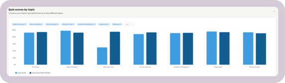
How it's calculated
We look at all completed content tagged with that topic across users.
The calculation is weighted by completions: content completed by more users has more impact on the topic average
The result is a single average score for the topic.
Note: If a user retakes a quiz, only their final attempt is included in the graph.
For example:
- Users complete several pieces of training with the “Passwords” tag
- All quiz results with this tag are combined and averaged
- The final score reflects overall performance for the topic
If the topic average is 89%, it means that, on average, users scored 89% on final quiz attempts across all “Password”-related content.
The quiz score benchmark is calculated by taking all users across the platform and averaging their final quiz scores.
Completed trainings per month
This graph shows how training completion changes over time. It displays how many trainings are completed each month.
Each bar on the graph represents the total number of completed trainings for that month.
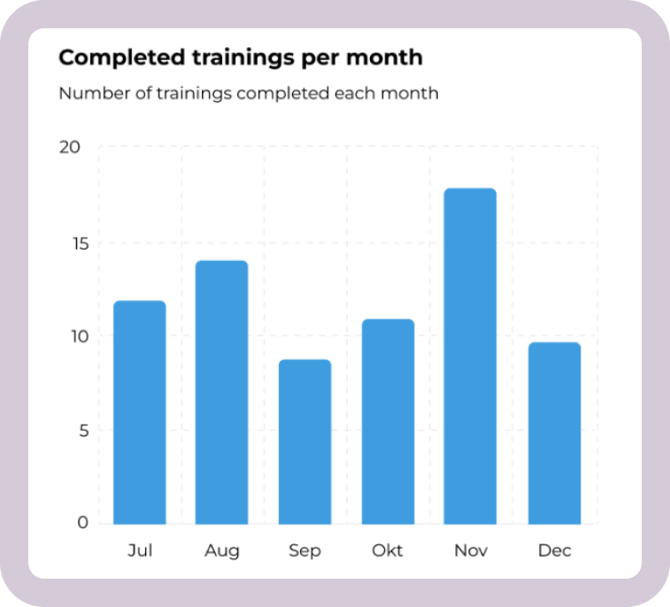
How it's calculated
For each month, the graph counts the total number of trainings that were completed during that month.
A training is counted in the month when it's completed, regardless of when the training was assigned or due.
Completion rate over time
This graph helps you see whether users are completing their assigned training on time or whether additional follow-up may be needed.
Each point on the graph represents the percentage of assigned training completed for that month.
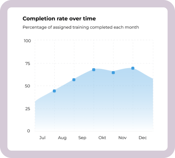
How it's calculated
For each month, we look at all training that users were enrolled by the end of that month. Then, we check how many of those trainings were completed by that same time.
-
For past months, this includes all training completed up to the end of the month.
-
For the current month, it shows how much training has been completed so far compared to how much has been assigned so far.
The result is a monthly completion percentage.
Users who have never logged in
This view shows how many users haven’t logged into the platform yet.
Clicking the number opens a user overview, where you can see which users haven’t logged in

Note: Login data is tracked only from 2024 onward.
Users who completed training before 2024 but have not completed any training since then may appear as “never logged in.”
Users with overdue training
This graph shows how many users have at least one overdue training in a given month.
A user is counted if they are enrolled in a training that was overdue and uncompleted at the final day of the month.
Each user is only counted once per month, even if they have more than one overdue training.
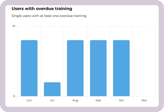
How it's calculated
A user is counted in a given month if at least one training meets all of the following:
- The due date is before the end of the month, and
- The training is not completed by the end of the month, and
- The user is still enrolled in the training
Users with overdue training by [filter]
This view shows how many users have overdue training at any point in time. It is a here-and-now view. Use the filter to view the data by managers or groups.
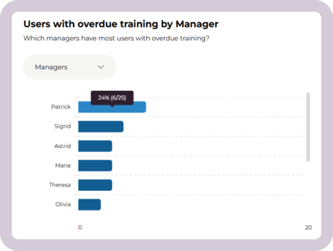
View by manager (default)
This view shows managers and how many of their direct reports currently have overdue training.
A manager is anyone who is set as Manager on another user’s profile. In this article, you can read how to fill in manager properties for your users.
A person can both be a manager and report to another manager.
If they have overdue training, they will appear on their own manager’s list of employees with overdue training. If they also manage others, they may separately appear as a manager whose team members have overdue training.
A user is counted if they have at least one training that is overdue as of today.
View by group
This view shows how overdue training is distributed across groups in your account.
You can read more about groups here.
For each group, you can see the percentage of members with overdue training and the number of members who currently have overdue training.
Users who belong to multiple groups are counted in each group they are part of.